Sales Performance Report
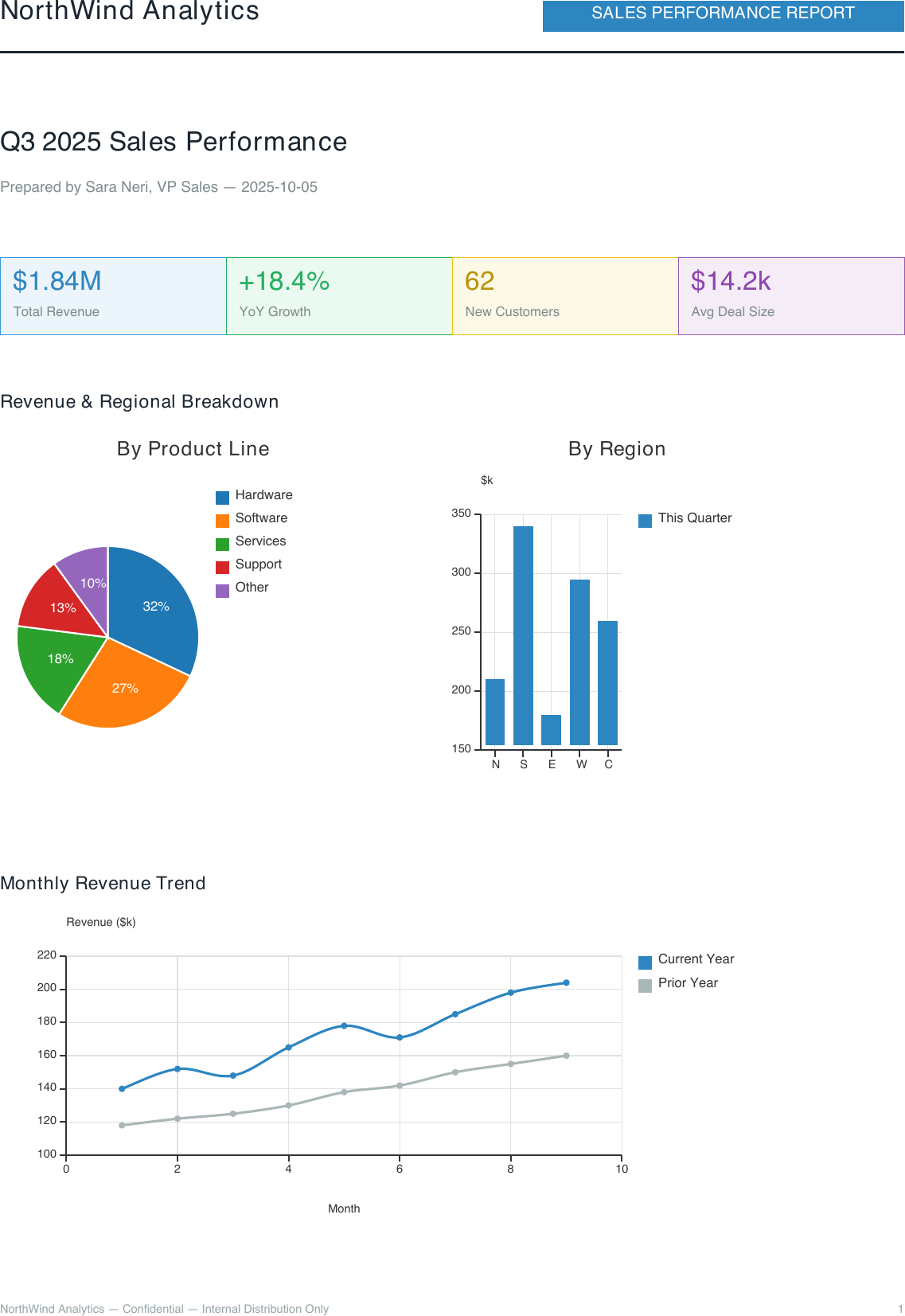
A chart-driven business report: KPI stat cards, a pie + histogram dashboard on
one <Canvas>, a year-over-year trend chart, and a top-accounts table — the
example to reach for when your document is built around data visualization
rather than tables of text (see Charts for the full
<Chart> reference).
Template — sales_report.craft
<Document>
<Settings>
<Page size="A4" orientation="portrait"/>
<SectionRatios header_ratio="0.08" body_ratio="0.84" footer_ratio="0.08"/>
</Settings>
<Metadata>
<Author>${company_name}</Author>
<Subject>Sales Performance Report — ${period}</Subject>
</Metadata>
<Header margin_left="25" margin_right="25" margin_top="8">
<Layout orientation="horizontal">
<Text weight="0.6" font_size="16" style="bold" color="#1B2631">${company_name}</Text>
<Rectangle weight="0.4" padding="4" background_color="#2E86C1">
<Text font_size="10" style="bold" alignment="center" color="white">SALES PERFORMANCE REPORT</Text>
</Rectangle>
</Layout>
<Line x1="0" y1="0" x2="545" y2="0" border_color="#1B2631" border_width="1.5"/>
</Header>
<Body margin_left="25" margin_right="25">
<Text font_size="16" style="bold" color="#1B2631">${period}</Text>
<Text font_size="9" color="#7F8C8D">Prepared by ${prepared_by} — ${report_date}</Text>
<Blank/>
<!-- KPI cards -->
<Layout orientation="horizontal">
<Rectangle weight="0.25" padding="8" background_color="#EBF5FB"
border_color="#3498DB" border_width="0.5">
<Text font_size="16" style="bold" color="#2E86C1">${total_revenue}</Text>
<Text font_size="8" color="#7F8C8D">Total Revenue</Text>
</Rectangle>
<Rectangle weight="0.25" padding="8" background_color="#EAFAF1"
border_color="#27AE60" border_width="0.5">
<Text font_size="16" style="bold" color="#27AE60">${yoy_growth}</Text>
<Text font_size="8" color="#7F8C8D">YoY Growth</Text>
</Rectangle>
<Rectangle weight="0.25" padding="8" background_color="#FEF9E7"
border_color="#F1C40F" border_width="0.5">
<Text font_size="16" style="bold" color="#B7950B">${new_customers}</Text>
<Text font_size="8" color="#7F8C8D">New Customers</Text>
</Rectangle>
<Rectangle weight="0.25" padding="8" background_color="#F4ECF7"
border_color="#9B59B6" border_width="0.5">
<Text font_size="16" style="bold" color="#8E44AD">${avg_deal_size}</Text>
<Text font_size="8" color="#7F8C8D">Avg Deal Size</Text>
</Rectangle>
</Layout>
<Blank/>
<!-- Revenue split + regional breakdown, two Charts on one Canvas -->
<Text font_size="11" style="bold" color="#1B2631">Revenue & Regional Breakdown</Text>
<Canvas width="495" height="230">
<Chart x="0" y="0" style="pie" width="240" height="220" title="By Product Line">
<Series model="${revenue_split}"/>
</Chart>
<Chart x="250" y="0" style="histogram" width="245" height="220"
title="By Region" y_label="$k">
<Series name="This Quarter" color="#2E86C1" model="${regional_sales}"/>
</Chart>
</Canvas>
<Blank/>
<!-- Monthly trend -->
<Text font_size="11" style="bold" color="#1B2631">Monthly Revenue Trend</Text>
<Chart style="spline" width="495" height="190" x_label="Month" y_label="Revenue ($k)">
<Series name="Current Year" color="#2E86C1" model="${trend_current}"/>
<Series name="Prior Year" color="#AAB7B8" model="${trend_prior}"/>
</Chart>
<Blank/>
<!-- Top accounts -->
<Text font_size="11" style="bold" color="#1B2631">Top Accounts</Text>
<Table model="${top_accounts}">
<THead>
<HTitle style="bold" font_size="9" background_color="#1B2631" color="white">Account</HTitle>
<HTitle style="bold" font_size="9" background_color="#1B2631" color="white">Revenue</HTitle>
<HTitle style="bold" font_size="9" background_color="#1B2631" color="white">Region</HTitle>
<HTitle style="bold" font_size="9" background_color="#1B2631" color="white">Status</HTitle>
</THead>
</Table>
</Body>
<Footer margin_left="25" margin_right="25">
<Layout orientation="horizontal">
<Text weight="0.5" font_size="7" color="#95A5A6">
${company_name} — Confidential — Internal Distribution Only
</Text>
<PageNumber weight="0.5" font_size="7" alignment="right" color="#95A5A6"/>
</Layout>
</Footer>
</Document>
Note
<Chart> nests inside <Canvas> like any other node – the “Revenue &
Regional Breakdown” section above places two independent charts (pie +
histogram) side by side on one canvas by giving each its own x. See
Combining Charts with Canvas
for more on this pattern.
Data — sales_report.json
{
  "company_name": "NorthWind Analytics",
  "period": "Q3 2025 Sales Performance",
  "prepared_by": "Sara Neri, VP Sales",
  "report_date": "2025-10-05",
  "total_revenue": "$1.84M",
  "yoy_growth": "+18.4%",
  "new_customers": "62",
  "avg_deal_size": "$14.2k",
  "revenue_split": [{"Hardware":32},{"Software":27},{"Services":18},
    {"Support":13},{"Other":10}],
  "regional_sales": [{"N":210},{"S":340},{"E":180},{"W":295},{"C":260}],
  "trend_current": [[1,140],[2,152],[3,148],[4,165],[5,178],[6,171],
    [7,185],[8,198],[9,204]],
  "trend_prior": [[1,118],[2,122],[3,125],[4,130],[5,138],[6,142],
    [7,150],[8,155],[9,160]],
  "top_accounts": [
    ["Acme Corporation",        "$182,400", "East",    "Active"],
    ["Globex Industries",       "$156,900", "North",   "Active"],
    ["Initech Solutions",       "$134,250", "West",    "Active"],
    ["Umbrella Manufacturing",  "$121,800", "Central", "Renewal Due"],
    ["Stark Logistics",         "$98,600",  "South",   "Active"]
  ]
}
Usage
docraft_tool sales_report.craft output/sales_report.pdf --data sales_report.json
Output Example
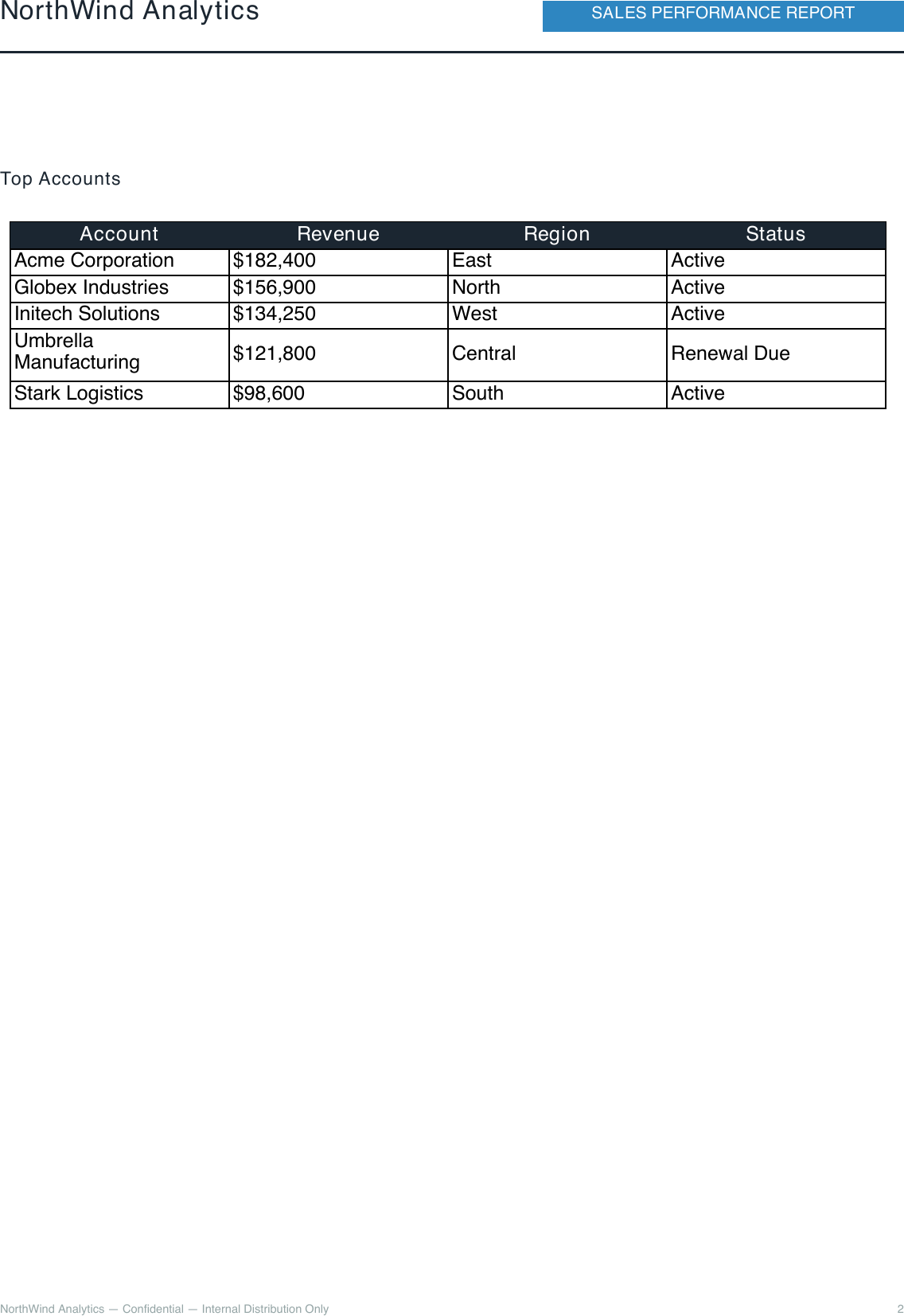
KPI cards, the revenue/regional chart dashboard, and the start of the trend chart fill page 1; the rest of the trend chart and the top-accounts table carry onto page 2: