Charts
<Chart> draws a data visualization – scatter, spline, line, histogram, or pie –
directly on the page, without shelling out to an external plotting library. Internally
it’s built on top of <Canvas> (see Shapes): each chart style is a small
“plugin” that fills a canvas with ordinary primitive nodes (lines, circles, rectangles,
text), so nothing renderer-side needs to know about charts at all.
A chart always needs explicit width/height and a style, and contains one or
more <Series> children supplying its data:
<Chart style="scatter" width="300" height="200" title="My Chart"
       x_label="X" y_label="Y">
  <Series name="A" color="blue" model='[[1,2],[3,4]]' />
</Chart>
<Chart> Attributes
In addition to the common node attributes (see Document Structure), <Chart> accepts:
Attribute |
Type |
Description |
|---|---|---|
|
string |
Required. One of |
|
float |
Required. Pixel size of the chart’s canvas. |
|
string |
Optional chart title, centered above the plot. |
|
string |
Optional axis labels. Ignored by |
|
string |
Where the axis lines cross: |
|
bool |
|
<Series> Attributes
Each <Chart> contains one or more <Series> elements supplying its data:
Attribute |
Type |
Description |
|---|---|---|
|
string |
Series label, shown in the legend (and, for |
|
color |
Series color. When omitted, a color is picked from a fixed palette, cycled by series index. |
|
JSON |
Required. The series’ data points, in one of two shapes (see below). |
A model is a JSON array whose entries are either:
Coordinate pairs –
[x, y]or{"x": ..., "y": ...}– for continuous data (scatter, spline, line), orLabeled values –
{"label": value}– for categorical data (histogram, pie). Each entry becomes one point atx= its ordinal position in the array,y= the value, with the key kept as that point’s category label (used for the X-axis tick in a histogram, or the slice label in a pie chart).
Data can also come from ${...} template substitution, the same as any other
model attribute (see Templating).
Chart Styles
Scatter
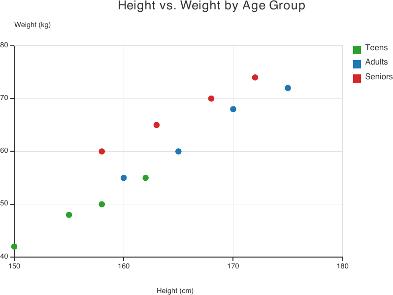
style="scatter" plots one dot per data point, unconnected – for showing the
relationship (or lack of one) between two continuous variables across one or more
series.
<Chart style="scatter" width="480" height="300" title="Height vs. Weight by Age Group"
       x_label="Height (cm)" y_label="Weight (kg)">
  <Series name="Teens" color="#2CA02C" model='[[150,42],[155,48],[158,50],[162,55]]' />
  <Series name="Adults" color="#1F77B4" model='[[160,55],[165,60],[170,68],[175,72]]' />
  <Series name="Seniors" color="#D62728" model='[[158,60],[163,65],[168,70],[172,74]]' />
</Chart>
Spline
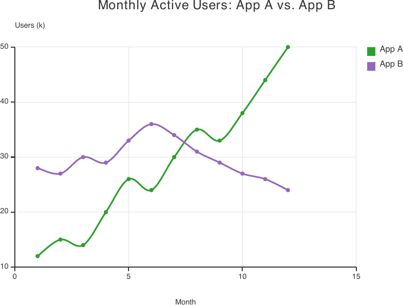
style="spline" draws a smooth, interpolated curve through each series’ points
(plus a marker dot at every point) – for a trend that should read as continuous
rather than piecewise-linear. Two series with crossing trends (below) show the
interpolation staying smooth right through the crossover.
<Chart style="spline" width="480" height="300" title="Monthly Active Users: App A vs. App B"
       x_label="Month" y_label="Users (k)">
  <Series name="App A" color="#2CA02C" model='[[1,12],[2,15],[3,14],[4,20],[5,26],[6,24],
    [7,30],[8,35],[9,33],[10,38],[11,44],[12,50]]' />
  <Series name="App B" color="#9467BD" model='[[1,28],[2,27],[3,30],[4,29],[5,33],[6,36],
    [7,34],[8,31],[9,29],[10,27],[11,26],[12,24]]' />
</Chart>
Line
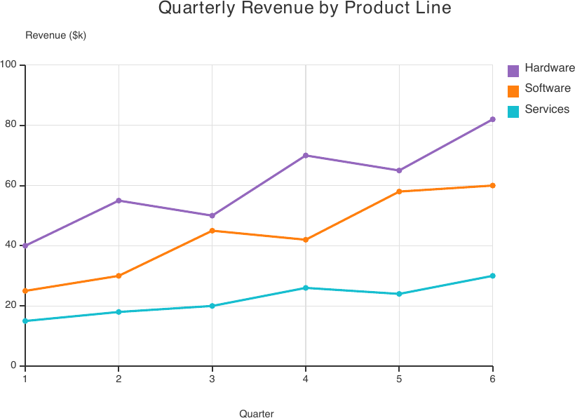
style="line" connects each series’ points with straight segments (plus a marker
dot at every point) – the same point model as spline, differing only in how
points are connected.
<Chart style="line" width="480" height="300" title="Quarterly Revenue by Product Line"
       x_label="Quarter" y_label="Revenue ($k)">
  <Series name="Hardware" color="#9467BD" model='[[1,40],[2,55],[3,50],[4,70],[5,65],[6,82]]' />
  <Series name="Software" color="#FF7F0E" model='[[1,25],[2,30],[3,45],[4,42],[5,58],[6,60]]' />
  <Series name="Services" color="#17BECF" model='[[1,15],[2,18],[3,20],[4,26],[5,24],[6,30]]' />
</Chart>
Histogram
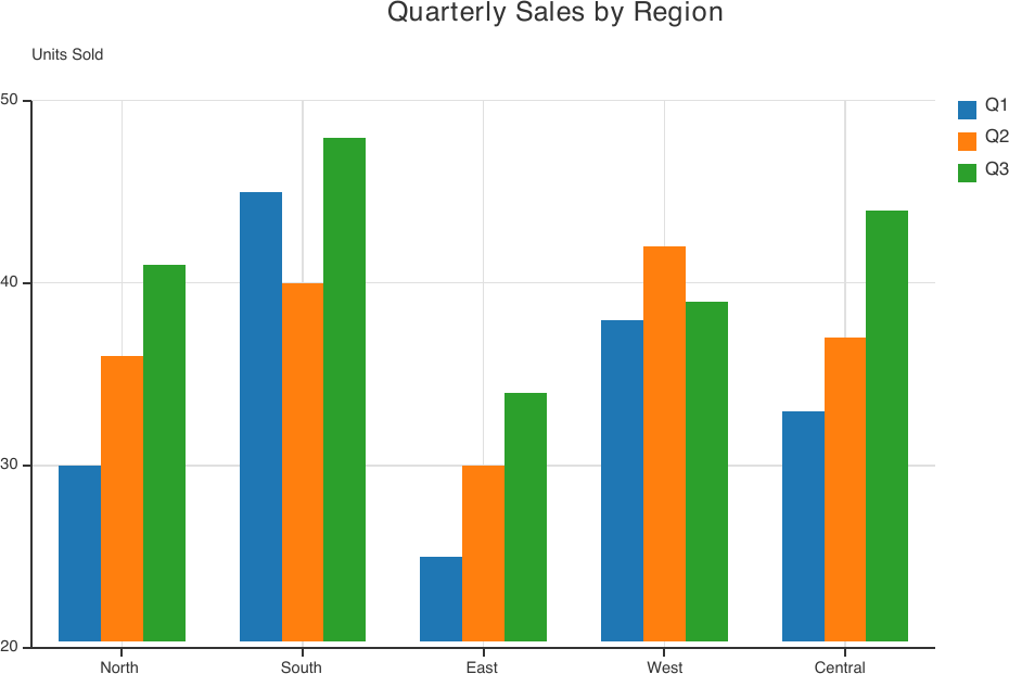
style="histogram" draws grouped bars, one per data point, grouped side-by-side by
series at each shared category – for comparing values across categories and, when
there’s more than one series, across groups within each category. Use the
{"label": value} model shape to get named categories on the X axis:
<Chart style="histogram" width="560" height="320" title="Quarterly Sales by Region"
       y_label="Units Sold">
  <Series name="Q1" color="#1F77B4" model='[{"North":30},{"South":45},{"East":25},
    {"West":38},{"Central":33}]' />
  <Series name="Q2" color="#FF7F0E" model='[{"North":36},{"South":40},{"East":30},
    {"West":42},{"Central":37}]' />
  <Series name="Q3" color="#2CA02C" model='[{"North":41},{"South":48},{"East":34},
    {"West":39},{"Central":44}]' />
</Chart>
Note
The Y axis auto-zooms to the actual data range rather than always starting at zero (visible above: the axis starts at 20, not 0) – so small differences between bars stay readable. A bar never sits flush against a non-zero baseline; a small gap always separates it from the axis line.
Pie
style="pie" draws one slice per data point across every <Series>, sized by its
share of the total. Unlike the other styles, a pie chart has no axes at all. Use the
{"label": value} model shape for a labeled category breakdown:
<Chart style="pie" width="480" height="300" title="Revenue by Product Line">
  <Series model='[{"Hardware":32},{"Software":27},{"Services":18},
    {"Support":13},{"Training":6},{"Other":4}]' />
</Chart>
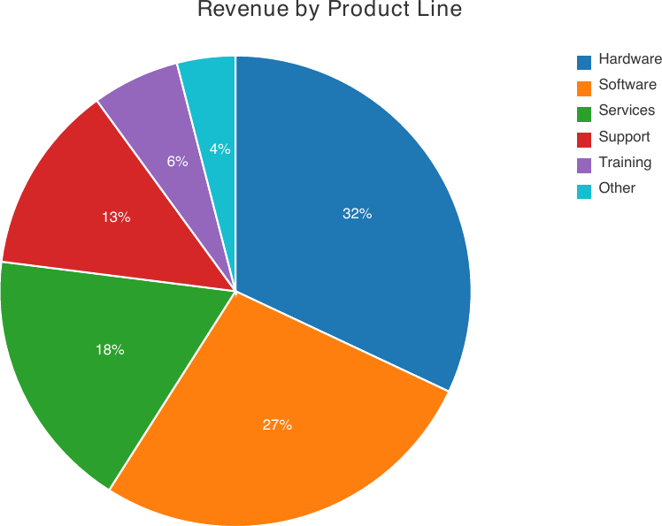
A series with a single point (one <Series> per slice) keeps that series’ own
color; a series with multiple points (one <Series> holding a whole category
breakdown, as above) cycles each of its slices through the default palette instead,
since a single series color can’t distinguish them. Points with a non-positive value
are skipped.
Combining Charts with Canvas
Because <Chart> is just another node, it can be nested as a child of <Canvas>
(see Shapes) alongside ordinary shapes and text – each positioned by its own
x/y, exactly like any other canvas child. This is how a multi-chart dashboard
or a chart annotated with custom callouts is built: there’s no dedicated “dashboard”
or “annotation” node, just composition.
Multiple Charts on One Canvas
A <Canvas> sized for a full widget grid, with three independent <Chart>
children (a pie, a histogram, and a line chart) plus a heading and divider lines
drawn as ordinary shapes:
<Canvas width="600" height="600" background_color="#FAFAFA"
        border_color="#DDDDDD" border_width="1">
  <Text x="20" y="16" font_size="13" style="bold">Q1-Q3 Business Overview</Text>
  <Line x1="20" y1="40" x2="580" y2="40" border_color="#DDDDDD" border_width="1"/>

  <Chart x="10" y="50" style="pie" width="290" height="230" title="Revenue Split">
    <Series model='[{"Hardware":32},{"Software":27},{"Services":18},
      {"Support":13},{"Other":10}]' />
  </Chart>
  <Chart x="300" y="50" style="histogram" width="290" height="230"
         title="Regional Sales" y_label="Units">
    <Series name="Q1" color="#1F77B4" model='[{"North":30},{"South":45},
      {"East":25},{"West":38}]' />
    <Series name="Q2" color="#FF7F0E" model='[{"North":36},{"South":40},
      {"East":30},{"West":42}]' />
  </Chart>

  <Line x1="20" y1="295" x2="580" y2="295" border_color="#DDDDDD" border_width="1"/>

  <Chart x="10" y="305" style="line" width="580" height="270" title="Monthly Growth Trend"
         x_label="Month" y_label="Revenue ($k)">
    <Series name="2025" color="#2CA02C" model='[[1,40],[2,45],[3,50],[4,55],
      [5,60],[6,58],[7,65],[8,72],[9,80]]' />
    <Series name="2024" color="#9467BD" model='[[1,30],[2,32],[3,35],[4,38],
      [5,40],[6,42],[7,44],[8,48],[9,50]]' />
  </Chart>
</Canvas>
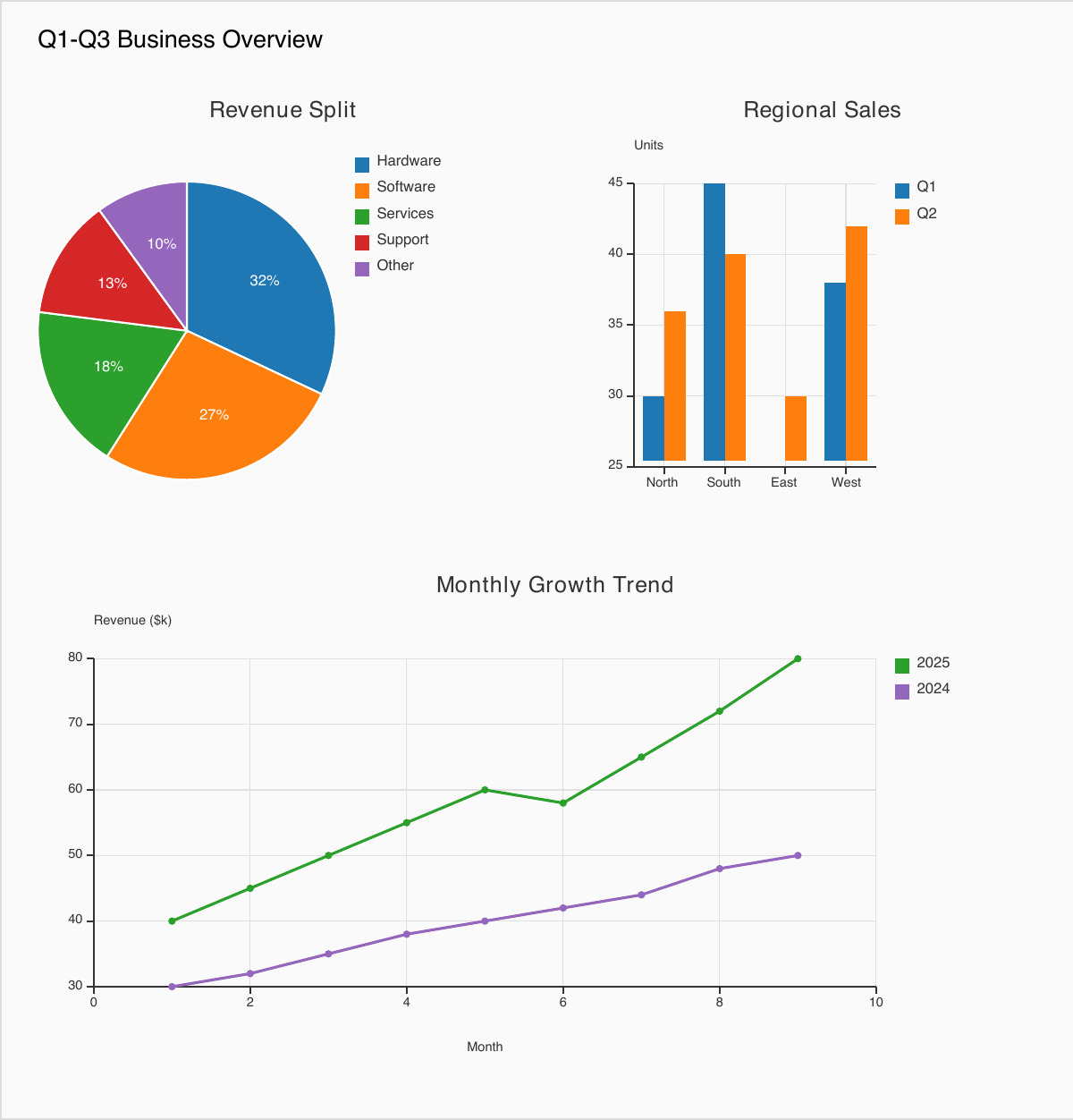
Each <Chart> lays out its own chrome (title, axes, legend) independently within
the bounding box its own width/height give it – the parent <Canvas>
doesn’t know or care that its children happen to be charts.
Annotating a Chart with Custom Callouts
A <Chart> has no built-in support for callouts or stat badges – but wrapping it
in a <Canvas> and adding ordinary <Rectangle>/<Text> siblings below it
gets the same effect:
<Canvas width="480" height="370" border_color="#DDDDDD" border_width="1">
  <Chart x="0" y="0" style="spline" width="480" height="300"
         title="Monthly Active Users: App A vs. App B"
         x_label="Month" y_label="Users (k)">
    <Series name="App A" color="#2CA02C" model='[[1,12],[2,15],[3,14],[4,20],
      [5,26],[6,24],[7,30],[8,35],[9,33],[10,38],[11,44],[12,50]]' />
    <Series name="App B" color="#9467BD" model='[[1,28],[2,27],[3,30],[4,29],
      [5,33],[6,36],[7,34],[8,31],[9,29],[10,27],[11,26],[12,24]]' />
  </Chart>

  <Rectangle x="10" y="310" width="145" height="46"
             background_color="#E8F5E9" border_color="#2CA02C" border_width="1"/>
  <Text x="18" y="317" font_size="9" style="bold" color="#2CA02C">Peak: 50k</Text>
  <Text x="18" y="332" font_size="7" color="#555555">App A, month 12</Text>

  <Rectangle x="320" y="310" width="150" height="46"
             background_color="#E3F2FD" border_color="#1F77B4" border_width="1"/>
  <Text x="328" y="317" font_size="9" style="bold" color="#1F77B4">Growth: +317%</Text>
  <Text x="328" y="332" font_size="7" color="#555555">App A, year over year</Text>
</Canvas>
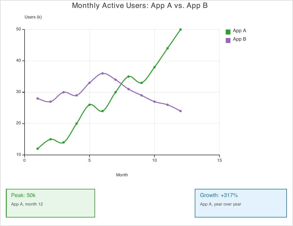
Note
A <Chart>’s own internal plot coordinates (where a given data point actually
lands in pixels) aren’t exposed back to the .craft file – so a callout can be
positioned relative to the chart’s outer bounding box (as above), but not
pixel-aligned to one specific data point without already knowing the chart’s own
axis-scaling.